Watercolor Stamping with Distress Inks + Reverse Confetti Sneak Peek
Hello there! I’m so glad you’ve stopped by today for some inspiration on creating easy watercoloring effects on your stamping! Today’s post is also showcasing the new Butterfly Dreams stamp and die set as part Reverse Confetti’s release sneak peeks week!

I love the look of watercoloring; when I started cardmaking back in 2007, it was actually the first medium I worked with to color my stamped images!
Here I’ve used distress inks to stamp the butterflies from Butterfly Dreams and then watercolored back over top of the entire stamped image (using the same color of ink I stamped with) to create a textured, watercolor effect. The texture from the stamping is created because distress inks do not stamp well with clear stamps; and because distress inks create a more translucent watercolor, you can see the texture through the ink that was applied on top. For the butterflies in this card I’ve used Seedless Preserves and Picked Raspberry inks.

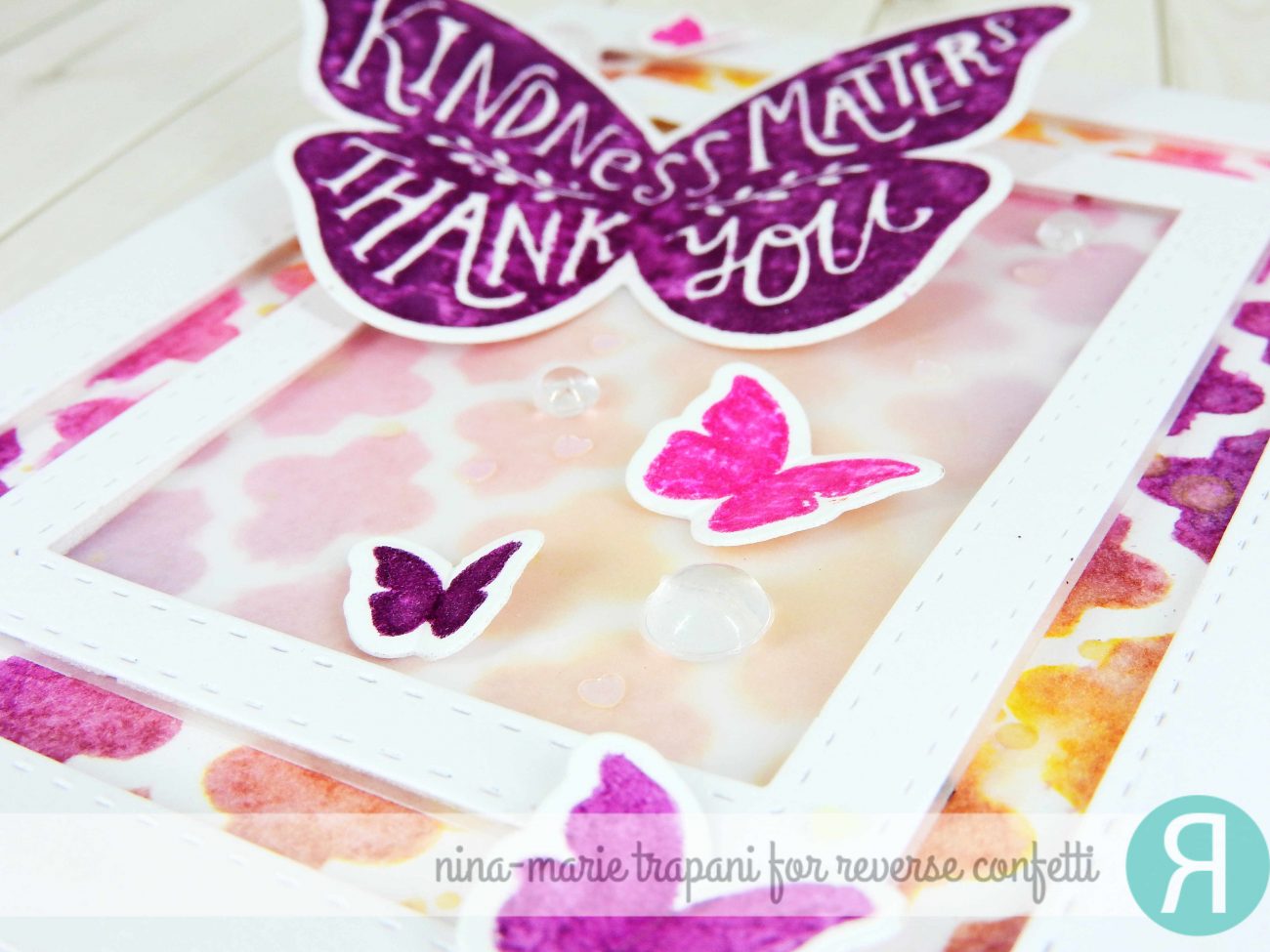
The Butterfly Dreams stamp set has a coordinating die set, which I used to die cut my butterflies out after they dried. I then began creating the panel that my butterflies are sitting on. To do this, I die cut two frames using a stitched rectangle die set, and layered them onto a distress ink background.
The background is created with Squeezed Lemonade, Picked Raspberry and Seedless Preserves inks applied with an ink blending tool over a tile stencil. To add some shimmer and a faux-watercolor look, I spritzed the ink blended background with some Perfect Pearl mist (before removing the stencil).
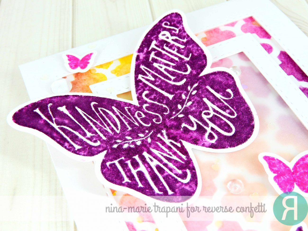
The butterflies are attached to my card by scoring them down the center (between the wings) and folding the wings in slightly to give a bit of dimension. I applied liquid adhesive along the fold and pressed them each down onto the card, one by one. In doing so, I’ve created a slight dimensional effect to the wings to make them appear more realistic and give some interest.
I finished the card off by scattering some Pretty Pink Posh Iridescent hearts along with some Clear Droplets. I also added some Wink of Stella glitter on the butterflies wings to tie in with the background.
The pairing of the background and the butterflies reminds me of a stained glass window, don’t you think???
MORE INSPIRATION
Looking for more Reverse Confetti inspiration? Here are two other cards I have created using some of their sneak peek products from yesterday, as well as their products from last month’s release! Click on the pictures to be taken to the corresponding post.
[one_half padding=”0 5px 0 5px”] [/one_half][one_half_last padding=”0 5px 0 5px”]
 [/one_half_last]
All the design team members for Reverse Confetti are also sharing gorgeous creations using today’s revealed products! Stop by their blogs if you haven’t already to check them out!
REVERSE CONFETTI BLOG
LISA ADDESA
AUDREY TOKACH
AMY KOLLING
AMY SHEFFER
AMY TSURUTA
LISA HENKE
HEATHER PULVIRENTI
LAURIE SCHMIDLIN
SUSAN LILES
AMY ROHL
LEIGH PENNER
KAY MILLER
And, March ‘Fetti Friend…
NINA-MARIE TRAPANI … that’s me! :)
PRODUCTS
If you are interested in any of the products used in this post, I have them all linked below to Simon Says Stamp. Affiliate links used when possible.
[su_expand more_text=”SHOW MORE” height=”400″ link_color=”#F27790″ more_icon=”icon: chevron-down” less_icon=”icon: chevron-up” class=”expand products”]
SIMON SAYS STAMP
 |
 |
 |
 |
 |
 |
 |
 |
 |
 |
 |
 |
 |
 |
[/su_expand]

 LinkDeli Free 15 day trial
Beautiful! Love the colors and background and the variegated colors on the butterfly!
Beautiful colorful beautiful card.
Nina-Marie, gorgeous display of butterflies and techniques. Thank you for the information regarding distress inks and clear stamps. The overstamping is a delightful way to add interest. Thanks for being a Fetti Friend as I have enjoyed Reverse Confetti’s blog hop.
Gorgeus!!!! Love, love, love!!!!1
This is such a pretty card! I love the background! It’s a beautiful blend of colors! I also really like the unique texture you created on the butterfly!
Lovely! Love love love it! Thanks for sharing!
Beautiful!!!
Very pretty card, love how you used the frames on the card!
Beautiful colors and design.
I love the purples!!
LOVE this colour combo, Nina!!! Wow. So glad you’re joining RC in March.
Love the colors. The vellum overlay is a wonderful idea.
thanks for sharing a beautiful card.
Love your creativity!!!
I love distress inks and I love your card!
This is truly gorgeous!! I MUST do ore with vellum!
So pretty and I love how the vellum softens the center.
WOW, simply amazing!!!
This is an absolutely gorgeous card!!! The background is so beautiful and the frames add a new dimension! We’re so glad to have you here as a guest designer! All your cards have been so beautiful and inspirational!! Welcome!
Ohhh, so pretty! I love the way you’ve used vellum! Fabulous!!
Kate
Small Bits of Paper
Great color combos!!
Gorgeous! Love the colors you put together….so bold and happy. Beautifully done ♥
Using the framed vellum was exactly the right thing to do. What an elegant effect.
The beautiful colors you have chosen make this card special looking!
gorgeous as usual!
Gorgeous layers and colors on your fabulous card! Love the look that vellum layer gives!
Your cards are absolutely gorgeous! Purple is one of my fave colors and I just love how you used it in your butterfly card!
I love the gorgeous color in all of your cards! The rich jewel tones of your butterfly card is especially striking! Wow!
Take care!
Michele
Love the background and colours you used!
Love the pretty colors on your creative card. Great design.
Gorgeous! Love the colors, the layout and the added softness of the vellum!
Love love love! I think I’m gonna pull out my vellum today! Thanks for so much inspiration!
Beautiful!! I love the background you created – so rich and vibrant! Love the effect that you added with the perfect pearls mist!
Gorgeous card – love your design!
Such a beautiful card, love the colors.
Love your card with so much texture and dimension!! Love the vellum on the frame and your colors!!
Beautiful card. Love the use of the panel!
simply beautiful!
Lovely card…purples and fuchsias are my favorites, so I love this striking card. The background is wonderful!
Gorgeous colors and design! ♥♥♥
I love your use of the frames to and interest. Very nice.