Enhancing Your Stamp Layering + Reverse Confetti March Guest
Hi Everyone! Today I have a technique to share with you on enhancing your stamp layering images with your coloring mediums. I will be using Copics for this card, but feel free to substitute them for your favorite medium.

I also have the pleasure of announcing that I am guesting with Reverse Confetti during the month of March! If you are new to Reverse Confetti, be sure to check out their online shop; they have lots of really creative stamps and dies to choose from. Their products are all of high quality and made in the USA… trust me when I say you will fall in love with them! :)

Today’s card is featuring their new Garden Bunch layering stamp set, as well as the Lord’s Strength sentiment set (all released in February). Both sets are beautiful and I love the encouraging/uplifting nature of the sentiments in the Lord’s Strength.
Enhancing your stamp layering images is a great way to add additional dimension and shading to your cards, and I started off by stamping all the flowers from Garden Bunch onto my white linen card base using Altenew Crisp dye inks.
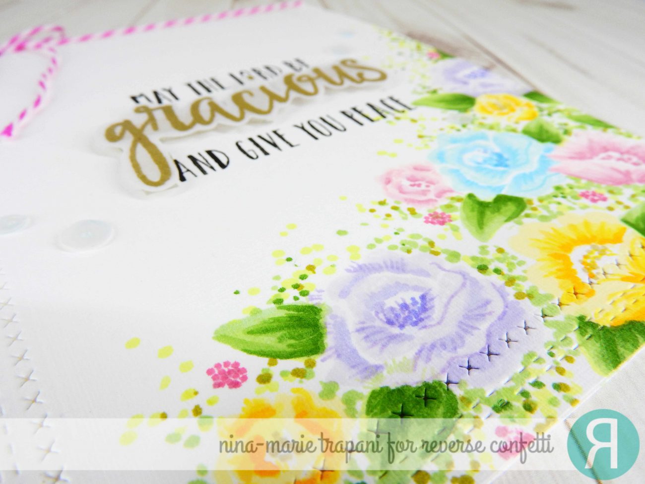
Once I had all my flowers stamped, I used my Copic markers and added in shading details to each flower, as well as drew in some leaves with a few green Copics.
Because I wanted to give the impression of greenery in the background, I used a few other green Copics to add in stippling around the flowers. Using a stippling (also known as the dot technique), is a great way to achieve lots of interesting texture and detail to your coloring, but I used it here for a more impressionistic style.
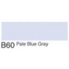
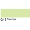
For those of you interested in the marker colors I used, I’ve got them broken down here, and linked to multiple sources in the products section at the bottom of the post:
- Purple flowers: B60, BV01, BV13
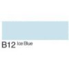
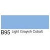
- Blue flowers: B00, B12, B95
- Pink Flowers: R81, R85
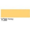
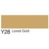
- Yellow flowers: Y11, YR31, Y38, Y28
- Leaves: G43, YG63, YG67
- Stippling: YG21, G43, YG67, YG95

After I had all my coloring finished, I stamped the sentiment twice; once heat embossed in gold onto vellum and then the second time in black on the card itself. I popped the vellum sentiment up with clear foam tape to give a bit of dimension and emphasize the sentiment a bit.
Finally I added some 4mm and 6mm Marshmallow sequins around the sentiment for a little embellishing and that finished up the card!
MORE INSPIRATION
If you enjoyed today’s card, I hope you’ll stop back March 5th-8th for inspiration using Reverse Confetti’s upcoming release!
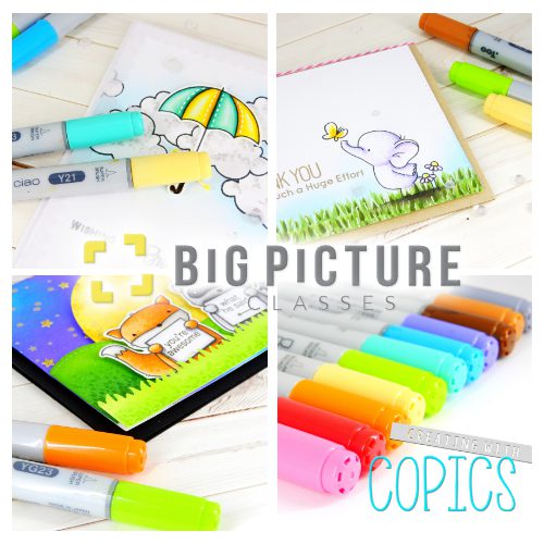
And for those of you interested in Copic coloring, I have a new class over on Big Picture Classes called Creating with Copics! During the class I will show you different ways to create realistic effects using simple techniques. Class opens on March 7th… hope to see you there!
PRODUCTS
If you are interested in any of the products used in this post, I have them all linked below to both Simon Says Stamp and Ellen Hutson. Affiliate links used when possible.
[su_expand more_text=”SHOW MORE” height=”400″ link_color=”#F27790″ more_icon=”icon: chevron-down” less_icon=”icon: chevron-up” class=”expand products”]
SIMON SAYS STAMP
 |
 |
 |
 |
 |
 |
 |
 |
 |
 |
 |
 |
 |
 |
 |
 |
 |
 |
 |
 |
 |
 |
 |
 |
 |
 |
 |
 |
 |
 |
 |
 |
 |
 |
 |
[/su_expand]
[su_expand more_text=”SHOW MORE” height=”400″ link_color=”#F27790″ more_icon=”icon: chevron-down” less_icon=”icon: chevron-up” class=”expand products”]
ELLEN HUTSON
 |
 |
 |
 |
 |
 |
 |
 |
 |
 |
 |
 |
 |
 |
 |
 |
 |
 |
 |
 |
 |
 |
 |
 |
 |
 |
 |
 |
 |
 |
 |
 |
 |
 |
 |
[/su_expand]

 LinkDeli Free 15 day trial
Beautiful! So happy to have you as ‘Fetti Friend this month! Welcome!
I’m so jealous, to be able to create a card like this. It is beautiful.
Outstanding technique Nina . TFS
You always amaze me with your fabulous coloring Nina!! Thank you for the pictorial!!
LOVE this looks of this technique! Thanks Nina!