Emboss Resist + Messy Watercolor Florals
[fusion_builder_container hundred_percent=”no” equal_height_columns=”no” hide_on_mobile=”small-visibility,medium-visibility,large-visibility” background_position=”center center” background_repeat=”no-repeat” fade=”no” background_parallax=”none” parallax_speed=”0.3″ video_aspect_ratio=”16:9″ video_loop=”yes” video_mute=”yes” overlay_opacity=”0.5″ border_style=”solid” admin_toggled=”no” admin_label=”Post Content”][fusion_builder_row][fusion_builder_column type=”1_1″ layout=”1_1″ background_position=”left top” background_color=”” border_size=”” border_color=”” border_style=”solid” border_position=”all” spacing=”yes” background_image=”” background_repeat=”no-repeat” padding=”” margin_top=”0px” margin_bottom=”0px” class=”” id=”” animation_type=”” animation_speed=”0.3″ animation_direction=”left” hide_on_mobile=”small-visibility,medium-visibility,large-visibility” center_content=”no” last=”no” min_height=”” hover_type=”none” link=””][fusion_imageframe image_id=”11356″ style_type=”none” hover_type=”zoomin” align=”center” lightbox=”yes” lightbox_image=”https://ninamariedesign.com/wp-content/uploads/2017/03/Watercolor-Florals_4.jpg” alt=”Emboss Resist + Messy Watercolor Florals | Nina-Marie Design” linktarget=”_self” hide_on_mobile=”small-visibility,medium-visibility,large-visibility” animation_direction=”left” animation_speed=”0.3″]https://ninamariedesign.com/wp-content/uploads/2017/03/Watercolor-Florals_4.jpg[/fusion_imageframe][fusion_separator style_type=”none” hide_on_mobile=”small-visibility,medium-visibility,large-visibility” top_margin=”10″ bottom_margin=”10″ alignment=”center” /][fusion_text]
Hello everyone and Happy Sunday! I wanted to share a video with you that I created for Simon Says Stamp. As we are SPRINGING ahead here in the United States with Daylight Savings Time, it is feeling a bit more like Spring is almost here. And with Spring comes warm weather and beautiful flowers.
[/fusion_text][fusion_separator style_type=”none” hide_on_mobile=”small-visibility,medium-visibility,large-visibility” top_margin=”10″ bottom_margin=”10″ alignment=”center” /][fusion_imageframe image_id=”11357″ style_type=”none” hover_type=”zoomin” align=”center” lightbox=”yes” lightbox_image=”https://ninamariedesign.com/wp-content/uploads/2017/03/Watercolor-Florals_2.jpg” alt=”Emboss Resist + Messy Watercolor Florals | Nina-Marie Design” linktarget=”_self” hide_on_mobile=”small-visibility,medium-visibility,large-visibility” animation_direction=”left” animation_speed=”0.3″]https://ninamariedesign.com/wp-content/uploads/2017/03/Watercolor-Florals_2.jpg[/fusion_imageframe][fusion_separator style_type=”none” hide_on_mobile=”small-visibility,medium-visibility,large-visibility” top_margin=”10″ bottom_margin=”10″ alignment=”center” /][fusion_text]
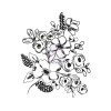
I wanted to use the gorgeous flower cling stamps from Prima. The illustrations on these stamps are so pretty; I’ve used both the Joyful Garden and Fresh Flowers #1 stamps. They are pretty large stamps, which cover the front of a card perfectly.
[/fusion_text][fusion_separator style_type=”none” hide_on_mobile=”small-visibility,medium-visibility,large-visibility” top_margin=”10″ bottom_margin=”10″ alignment=”center” /][fusion_imageframe image_id=”11358″ style_type=”none” hover_type=”zoomin” align=”center” lightbox=”yes” lightbox_image=”https://ninamariedesign.com/wp-content/uploads/2017/03/Watercolor-Florals_7.jpg” alt=”Emboss Resist + Messy Watercolor Florals | Nina-Marie Design” linktarget=”_self” hide_on_mobile=”small-visibility,medium-visibility,large-visibility” animation_direction=”left” animation_speed=”0.3″]https://ninamariedesign.com/wp-content/uploads/2017/03/Watercolor-Florals_7.jpg[/fusion_imageframe][fusion_separator style_type=”none” hide_on_mobile=”small-visibility,medium-visibility,large-visibility” top_margin=”10″ bottom_margin=”10″ alignment=”center” /][fusion_text]
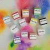
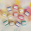
For the watercolors, I used Prima’s Watercolor Confections; these watercolors come in 5 different palettes. On these cards I used three: the Classics, Tropicals and Decadent Pies. I enjoy using these palettes . The watercolors are quite pigmented and give beautiful results in a variety of painting styles. In today’s video I created a “messy” style of watercoloring, which is really easy to achieve; I’ll be walking you through the steps I took to create the messy look effortlessly!
[/fusion_text][fusion_separator style_type=”none” hide_on_mobile=”small-visibility,medium-visibility,large-visibility” top_margin=”10″ bottom_margin=”10″ alignment=”center” /][fusion_imageframe image_id=”11360″ style_type=”none” hover_type=”zoomin” align=”center” lightbox=”yes” lightbox_image=”https://ninamariedesign.com/wp-content/uploads/2017/03/Watercolor-Florals_5.jpg” alt=”Emboss Resist + Messy Watercolor Florals | Nina-Marie Design” linktarget=”_self” hide_on_mobile=”small-visibility,medium-visibility,large-visibility” animation_direction=”left” animation_speed=”0.3″]https://ninamariedesign.com/wp-content/uploads/2017/03/Watercolor-Florals_5.jpg[/fusion_imageframe][fusion_separator style_type=”none” hide_on_mobile=”small-visibility,medium-visibility,large-visibility” top_margin=”10″ bottom_margin=”10″ alignment=”center” /][fusion_text]
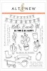
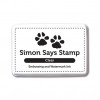
I love sentiments that are perfect for encouragement cards; the Be Strong stamp set from Altenew is one of my current favorites when it comes to uplifting sentiments! I stamped two of the greetings from that set with clear ink and heat embossed them with white powder.
The watercolor panels are trimmed down with the Simon Says Stamp Stitched Rectangle dies and I also tied a bit of Hemptique bamboo cord around the top.
[/fusion_text][fusion_separator style_type=”none” hide_on_mobile=”small-visibility,medium-visibility,large-visibility” top_margin=”10″ bottom_margin=”10″ alignment=”center” /][fusion_imageframe image_id=”11359″ style_type=”none” hover_type=”zoomin” align=”center” lightbox=”yes” lightbox_image=”https://ninamariedesign.com/wp-content/uploads/2017/03/Watercolor-Florals_3.jpg” alt=”Emboss Resist + Messy Watercolor Florals | Nina-Marie Design” linktarget=”_self” hide_on_mobile=”small-visibility,medium-visibility,large-visibility” animation_direction=”left” animation_speed=”0.3″]https://ninamariedesign.com/wp-content/uploads/2017/03/Watercolor-Florals_3.jpg[/fusion_imageframe][fusion_separator style_type=”none” hide_on_mobile=”small-visibility,medium-visibility,large-visibility” top_margin=”10″ bottom_margin=”10″ alignment=”center” /][fusion_text]
Finally, I wanted to make a couple of matching envelopes for these cards… a card is made even more special when the envelope is decorated too! I used the We R Memory Envelope Punch Board to make the envelope from Mixed Media paper and then watercolored a soft, layered background. The background was created with a few watercolors that matched the card but were greatly diluted.
After watercoloring, I stamped a second generation of the flowers onto each of the envelopes using a gray ink from Altenew. Because I wanted the image on the envelope to be softer, the second generation creates more of a “ghosted” look and is not distracting.
[/fusion_text][fusion_separator style_type=”none” hide_on_mobile=”small-visibility,medium-visibility,large-visibility” top_margin=”10″ bottom_margin=”10″ alignment=”center” /][fusion_imageframe image_id=”11361″ style_type=”none” hover_type=”zoomin” align=”center” lightbox=”yes” lightbox_image=”https://ninamariedesign.com/wp-content/uploads/2017/03/Watercolor-Florals_6.jpg” alt=”Emboss Resist + Messy Watercolor Florals | Nina-Marie Design” linktarget=”_self” hide_on_mobile=”small-visibility,medium-visibility,large-visibility” animation_direction=”left” animation_speed=”0.3″]https://ninamariedesign.com/wp-content/uploads/2017/03/Watercolor-Florals_6.jpg[/fusion_imageframe][fusion_separator style_type=”none” hide_on_mobile=”small-visibility,medium-visibility,large-visibility” top_margin=”10″ bottom_margin=”10″ alignment=”center” /][fusion_text]
I hope you enjoyed these cards and will be checking out the video to see how these cards came together! I really like how the heat embossed flowers resist the watercolor and create more subtle outlines. And paired with the messy watercolor effect, I think it makes for a very beautiful design! Thanks for visiting me today… I will see you again tomorrow for a new Studio Monday video!
[/fusion_text][/fusion_builder_column][/fusion_builder_row][/fusion_builder_container][fusion_builder_container hundred_percent=”no” equal_height_columns=”no” hide_on_mobile=”small-visibility,medium-visibility,large-visibility” background_position=”center center” background_repeat=”no-repeat” fade=”no” background_parallax=”none” enable_mobile=”no” parallax_speed=”0.3″ video_aspect_ratio=”16:9″ video_loop=”yes” video_mute=”yes” overlay_opacity=”0.5″ border_style=”solid” padding_top=”20px” padding_bottom=”20px” admin_label=”Video”][fusion_builder_row][fusion_builder_column type=”1_1″ layout=”1_1″ spacing=”” center_content=”no” hover_type=”none” link=”” min_height=”” hide_on_mobile=”small-visibility,medium-visibility,large-visibility” class=”” id=”” background_color=”” background_image=”” background_position=”left top” background_repeat=”no-repeat” border_size=”0″ border_color=”” border_style=”solid” border_position=”all” padding=”” dimension_margin=”” animation_type=”” animation_direction=”left” animation_speed=”0.3″ animation_offset=”” last=”no”][fusion_title hide_on_mobile=”small-visibility,medium-visibility,large-visibility” size=”1″ content_align=”left” style_type=”default”]
WATCH THE VIDEO
[/fusion_title][fusion_separator style_type=”none” hide_on_mobile=”small-visibility,medium-visibility,large-visibility” top_margin=”10″ bottom_margin=”10″ alignment=”center” /][fusion_youtube id=”https://youtu.be/pRa-8boB2OE” width=”800″ height=”450″ autoplay=”false” hide_on_mobile=”small-visibility,medium-visibility,large-visibility” /][/fusion_builder_column][/fusion_builder_row][/fusion_builder_container][fusion_builder_container hundred_percent=”no” equal_height_columns=”no” hide_on_mobile=”small-visibility,medium-visibility,large-visibility” background_position=”center center” background_repeat=”no-repeat” fade=”no” background_parallax=”none” enable_mobile=”no” parallax_speed=”0.3″ video_aspect_ratio=”16:9″ video_loop=”yes” video_mute=”yes” overlay_opacity=”0.5″ border_style=”solid” padding_top=”20px” padding_bottom=”20px” admin_label=”Share”][fusion_builder_row][fusion_builder_column type=”1_1″ layout=”1_1″ spacing=”” center_content=”no” hover_type=”none” link=”” min_height=”” hide_on_mobile=”small-visibility,medium-visibility,large-visibility” class=”” id=”” background_color=”” background_image=”” background_position=”left top” background_repeat=”no-repeat” border_size=”0″ border_color=”” border_style=”solid” border_position=”all” padding=”” animation_type=”” animation_direction=”left” animation_speed=”0.3″ animation_offset=”” last=”no”][fusion_title hide_on_mobile=”small-visibility,medium-visibility,large-visibility” size=”1″ content_align=”left” style_type=”default”]
SHARE THIS POST ON SOCIAL MEDIA
[/fusion_title][fusion_separator style_type=”none” hide_on_mobile=”small-visibility,medium-visibility,large-visibility” top_margin=”10″ bottom_margin=”10″ alignment=”center” /][/fusion_builder_column][fusion_builder_column type=”1_2″ layout=”1_2″ spacing=”” center_content=”no” hover_type=”none” link=”” min_height=”” hide_on_mobile=”small-visibility,medium-visibility,large-visibility” class=”” id=”” background_color=”” background_image=”” background_position=”left top” undefined=”” background_repeat=”no-repeat” border_size=”0″ border_color=”” border_style=”solid” border_position=”all” padding=”” margin_top=”” margin_bottom=”” animation_type=”” animation_direction=”left” animation_speed=”0.3″ animation_offset=”” last=”no”][fusion_imageframe image_id=”11362″ style_type=”none” hover_type=”none” align=”none” lightbox=”no” linktarget=”_self” hide_on_mobile=”small-visibility,medium-visibility,large-visibility” animation_direction=”left” animation_speed=”0.3″]https://ninamariedesign.com/wp-content/uploads/2017/03/Watercolor-Florals_social-media.jpg[/fusion_imageframe][/fusion_builder_column][fusion_builder_column type=”1_2″ layout=”1_2″ spacing=”” center_content=”no” hover_type=”none” link=”” min_height=”” hide_on_mobile=”small-visibility,medium-visibility,large-visibility” class=”” id=”” background_color=”” background_image=”” background_position=”left top” undefined=”” background_repeat=”no-repeat” border_size=”0″ border_color=”” border_style=”solid” border_position=”all” padding=”” margin_top=”” margin_bottom=”” animation_type=”” animation_direction=”left” animation_speed=”0.3″ animation_offset=”” last=”no” element_content=””][/fusion_builder_column][/fusion_builder_row][/fusion_builder_container][fusion_builder_container hundred_percent=”no” equal_height_columns=”no” hide_on_mobile=”small-visibility,medium-visibility,large-visibility” background_position=”center center” background_repeat=”no-repeat” fade=”no” background_parallax=”none” enable_mobile=”no” parallax_speed=”0.3″ video_aspect_ratio=”16:9″ video_loop=”yes” video_mute=”yes” overlay_opacity=”0.5″ border_style=”solid” padding_top=”20px” padding_bottom=”20px” admin_label=”Products”][fusion_builder_row][fusion_builder_column type=”1_1″ layout=”1_1″ spacing=”” center_content=”no” hover_type=”none” link=”” min_height=”” hide_on_mobile=”small-visibility,medium-visibility,large-visibility” class=”” id=”” background_color=”” background_image=”” background_position=”left top” background_repeat=”no-repeat” border_size=”0″ border_color=”” border_style=”solid” border_position=”all” padding=”” animation_type=”” animation_direction=”left” animation_speed=”0.3″ animation_offset=”” last=”no”][fusion_title hide_on_mobile=”small-visibility,medium-visibility,large-visibility” size=”1″ content_align=”left” style_type=”default”]
SUPPLIES
[/fusion_title][fusion_separator style_type=”none” hide_on_mobile=”small-visibility,medium-visibility,large-visibility” top_margin=”10″ bottom_margin=”10″ alignment=”center” /][fusion_text]


[/fusion_text][/fusion_builder_column][/fusion_builder_row][/fusion_builder_container]

 LinkDeli Free 15 day trial