Shading Stamped Images with Copics + Reverse Confetti Sneak Peeks
Hello and Happy Monday everyone! Thanks so much for stopping by today, as I am sharing a card on adding shading to your stamped images using Copic markers.
Today’s card is part of the Reverse Confetti Sneak Peeks week; I also have two other posts for today. If you are looking for one of my other posts, see these links: Neat & Tangled Reveal Day #1 post or the Whimsy Stamps Reveal Day #1 post.

So for today’s Reverse Confetti sneak peek, I am showcasing the lovely Rose Garden stamps and dies. The stamps in this set are really great for creating a custom grouping of roses, in both solid and outline styles (I’ll have more inspiration for you tomorrow on using the outline image with watercoloring!). Today though, I used the solid images and coordinating dies.
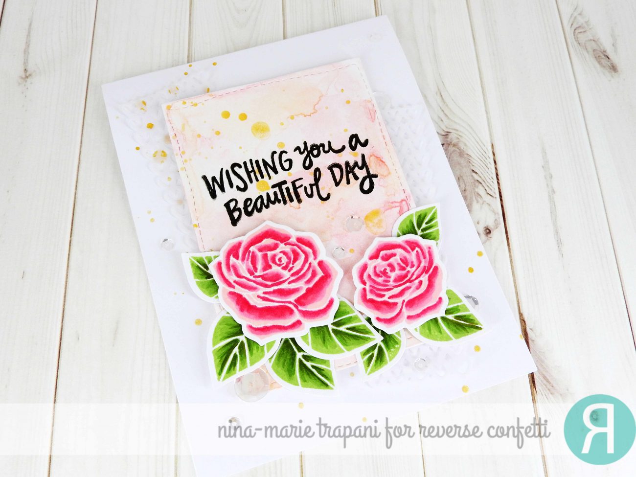
I started off by stamping the solid images onto cardstock with Altenew dye inks (Cotton Candy and Frayed Leaf). I used Altenew inks because they are Copic friendly and there are a lot of great colors. Once I had the images stamped, I brought in my Copics to add shading. I love adding additional shading to my stamped images because it really helps them have a more life-like and dimensional feel.
The colors I used for the roses and leaves are listed out below, and are linked down in the products section at the bottom of this post:
- Roses: RV13, RV29
- Leaves: YG63, YG67, YG97

After my coloring was complete, I used the coordinating dies to cut the images out. I also used the cute Double Panel Hearts die set to create some vellum accent pieces that are layered behind the panel my flowers are sitting on. The vellum gives a subtle texture to the card design and ties into the feminine feel of the pink roses.
As for that panel I mentioned; I stamped my sentiment (from that same Rose Garden stamp set) in Black Onyx Versafine ink and heat embossed it with clear embossing powder. I them watercolored the panel with Heidi Swapp color shine sprays for a soft, shimmery effect. I used the same sprays to create splatters on my card base.

Finally, I used Pretty Pink Posh Sparkling Clear sequins to add a bit more interest to the design… and also because I cannot resist anything that sparkles! :)
MORE INSPIRATION & CREATING WITH COPICS CLASS
Looking for more Reverse Confetti inspiration? Be sure to check out my other cards from this past week featuring their newest stamps and dies! Click on the photos to be taken to the corresponding posts.
[one_third padding=”0 5px 0 5px”] [/one_third][one_third padding=”0 5px 0 5px”]
 [/one_third][one_third_last padding=”0 5px 0 5px”]
 [/one_third_last]
All the design team members for Reverse Confetti are also sharing gorgeous creations using today’s revealed products! Stop by their blogs if you haven’t already to check them out!
REVERSE CONFETTI BLOG
LISA ADDESA
AUDREY TOKACH
AMY KOLLING
AMY SHEFFER
AMY TSURUTA
LISA HENKE
HEATHER PULVIRENTI
LAURIE SCHMIDLIN
SUSAN LILES
AMY ROHL
LEIGH PENNER
KAY MILLER
And, March ‘Fetti Friend…
NINA-MARIE TRAPANI … that’s me! :)
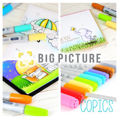
And today is the kick off of my Creating with Copics class over at Big Picture Classes! You can sign up for their class membership of $9.95 a month which gives you unlimited access to all their previous, current and future classes (for as long as you remain a member). In my class I will be sharing simple techniques that you can use to achieve realistic and amazing results to your coloring. Visit the Big Picture Classes site for more details!
PRODUCTS
If you are interested in any of the products used in this post, I have them all linked below to Simon Says Stamp. Affiliate links used when possible.
[su_expand more_text=”SHOW MORE” height=”400″ link_color=”#F27790″ more_icon=”icon: chevron-down” less_icon=”icon: chevron-up” class=”expand products”]
SIMON SAYS STAMP
 |
 |
 |
 |
 |
 |
 |
 |
 |
 |
 |
 |
 |
 |
 |
 |
[/su_expand]

 LinkDeli Free 15 day trial
Beautiful card, Nina-Marie! Love the depth of color and shading on the roses and leaves!
U colour beautifully
I love pink roses!! Your card is so soft and pretty!!
Beautiful card. Love the coloring.
Love how you colored those roses. Beautiful!!!
Beautiful card! LOVE your shading on those gorgeous roses ♥
Scrumptious card! I love the coloring, layers and background to showcase the gorgeous roses! Lovely card!
Beautiful card with such amazing depth!! Thanks for sharing the copic colors too.
Such a beautifully executed card. Love the layers of color and the use of the double heart panel for texture and even more pizazz.
Gorgeous card with
beautiful watercoloring!
Carla from Utah
Your roses are so lovely.
Absolutely lovely!!!!
The rose has so much depth. You can see down into the inside of the flower.
Beautiful card.
thanks for sharing.
Beautiful! I love how you colored the roses! They really stand out against that gorgeous watercolor background.
great work, such lovely shading!
So, so pretty! Thanks for taking the time to write out the details of how you created your card. I am especially taken with the background. It’s gorgeous – and just perfect with the flowers!
Kate
Small Bits of Paper
What amazing creation! I love the beautiful roses!!!
I searched and searched for the vellum and then wham! I saw it and omg… what an impact and you don’t really even realize it… my eyes were just seeing texture there… this is gorgeous… as always…
I love your style and design used to create such a beautiful card. The flowers come alive with the shading. Hope I get to own the set.
I love this technique! I really makes the roses more life-like! Beautiful!
Nina-Marie, your card for today is so lovely, with softness and sparkle. I like how you tell about it, All the droplets and the vellum add so much interest.
Beautiful roses. I like how you added the shading.
Amazing card! ♥♥♥
Hi Nina-Marie, I sooo sad that this is the last day of sneak peeks! However, your card has added smiles. Your work is gorgeous, you have added so much realism to Rose Garden stamp set using inks and copic markers. Thank you for sharing your creative talent and leaving advise along the way. I look forward to your post tomorrow and the upcoming release!
Love the detail you’ve acheived. So pretty.
What a beautiful card! LOve the colors and layering. the new stamp set with matching dies is wonderful.
~Gin K.~
The shading on your roses and extra layers of color on the leaves makes them extra lovely!